Teespring Storefronts 2.0
July 2016
Status: Shipped ✅
Role: Lead Product Designer
Collaborators: 1 Product Manager, 5 Engineers, 1 Data Scientist
Platforms: Web and Mobile Web
Press: Teespring Tools: Storefronts
Link: Teespring

Context around the team and roles
This project was a part of the Teespring's Buyer & Creator pod. I was the lead Product Designer for Buyer pod at the time, but because this product had Creator pod dependencies, I ended up leading design for both pods. There was also 2 Product Managers, ~7 or 8 engineers and 2 data scientists on the project.
As a product designer, I owned and drove all of the user interviews, market research, user research, prototypes and final implementation on interaction and visual design.
Market opportunity and company direction
As a company, Teespring was becoming a dominant horse in its race for custom apparel and product commerce, but other competitors began to catch up to our feature set. We had to find new ways to capitalize on our current creators, onboard new ones and retain our buyers.
The Growth & Data team took the initiative to find correlated data between Creators and Buyers that we could capitalize on. They dug deep into our platform's data and found that the majority of repeat buyers on our platform were coming from products within the same storefront. In other words, the same Creator.
This was an interesting set of data we had found, it was a fundamental feature that enabled our two-sided market relationship between Buyer and Creator to flourish.

Validating the project & core metrics
We wanted to find the smallest possible test we can push to validate the correlation that buyers do indeed connect more with the product when creators have a storefront.
We decided to test that validation on our product cards on the campaign page and elsewhere on the platform. We performed an a/b test, placing from & storefront-name metadata underneath the campaign title, and watched the difference in click-thru rates and difference in conversion.
Results came back and our intuition was right, buyers click-thru rate went up and conversion went up. We took this back to leadership and pitched a full fledge re-design of Storefronts on the buyer side and creator side. The metrics we were trying to hit with this project were the following:
- Improve buyer retention
- Improve campaign page conversion and traffic to storefronts
Figuring out what to build
To understand how we can improve storefronts, we really needed to understand the history of the feature on teespring.com and how its currently being used. I learned that it was initially a hack-a-thon project that ended being pushed out live and our creators began using it sparingly. Little did we know, it would be the very foundation that we use to pivot our product to humanize our creators more.
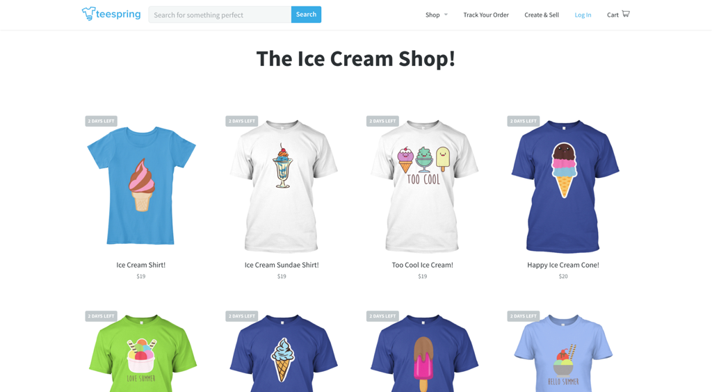
This is what the old storefront looked like for a buyer:
We invited creators to our SF offices to do product review sessions with us. To walk us through how they currently use storefronts and to find some common wishlist features. We began to narrow down some of these wishlist features with our product team and figure out a viable 2.0 we could deliver that would benefit our creators and increase engagement from our buyers.
The feature list we compiled was:
- Ability to add a custom logo or graphic
- Ability to add a custom brand anchor color
- Ability to add a store description
- Ability to add a banner with custom imagery and type
- Ability to follow a storefront
- Ability to add social links to further buyer/creator connection
- De-emphasizing Teespring's branding on the storefront url
We were confident that this feature list would increase the engagement and traffic to our storefronts, while helping our creators to have a better retention rate with their buyers.
Creator flow
For the creator side of storefronts, there was two flows the creator could take when you were on the storefront url:
- Manage your storefront info
- Manage your products
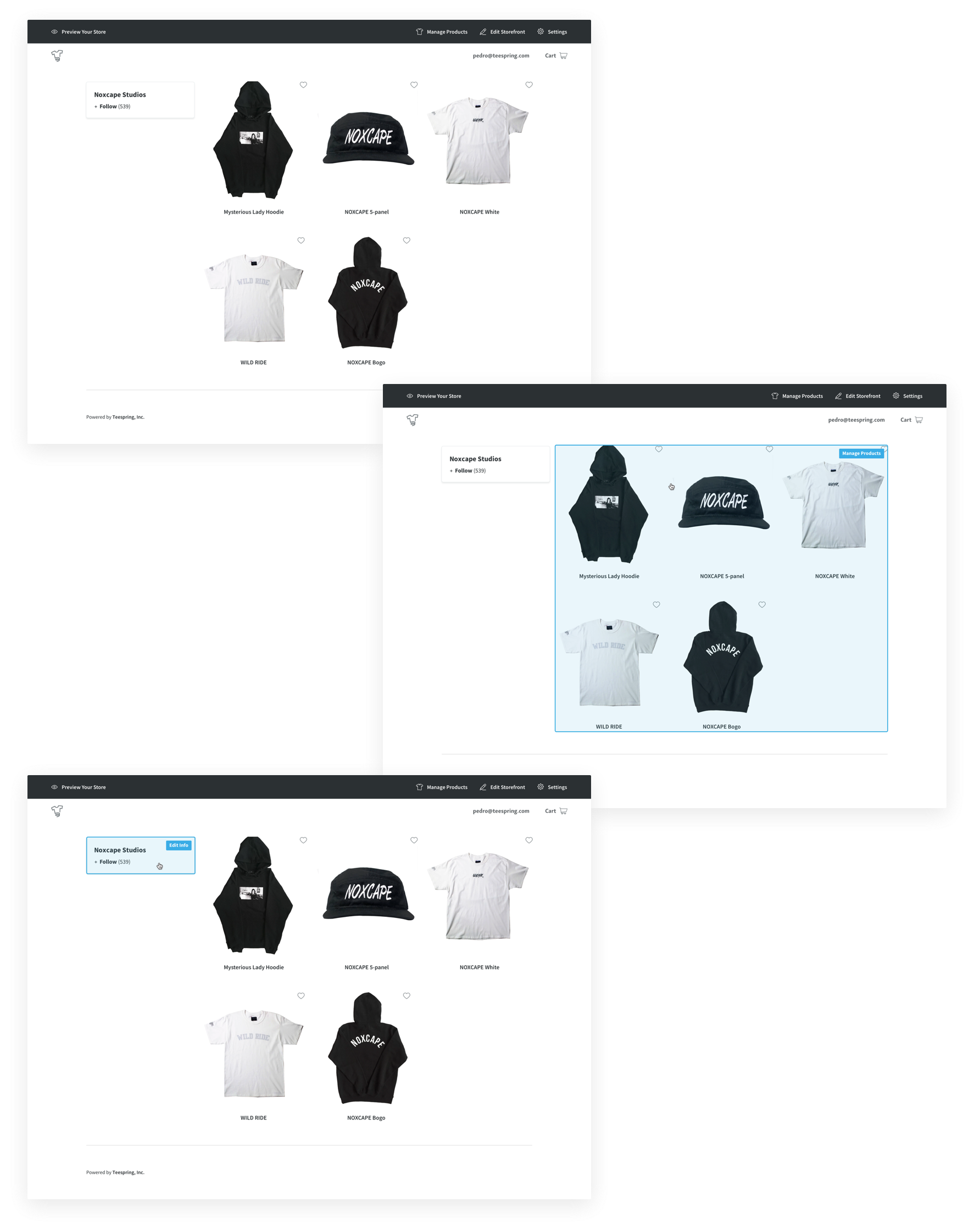
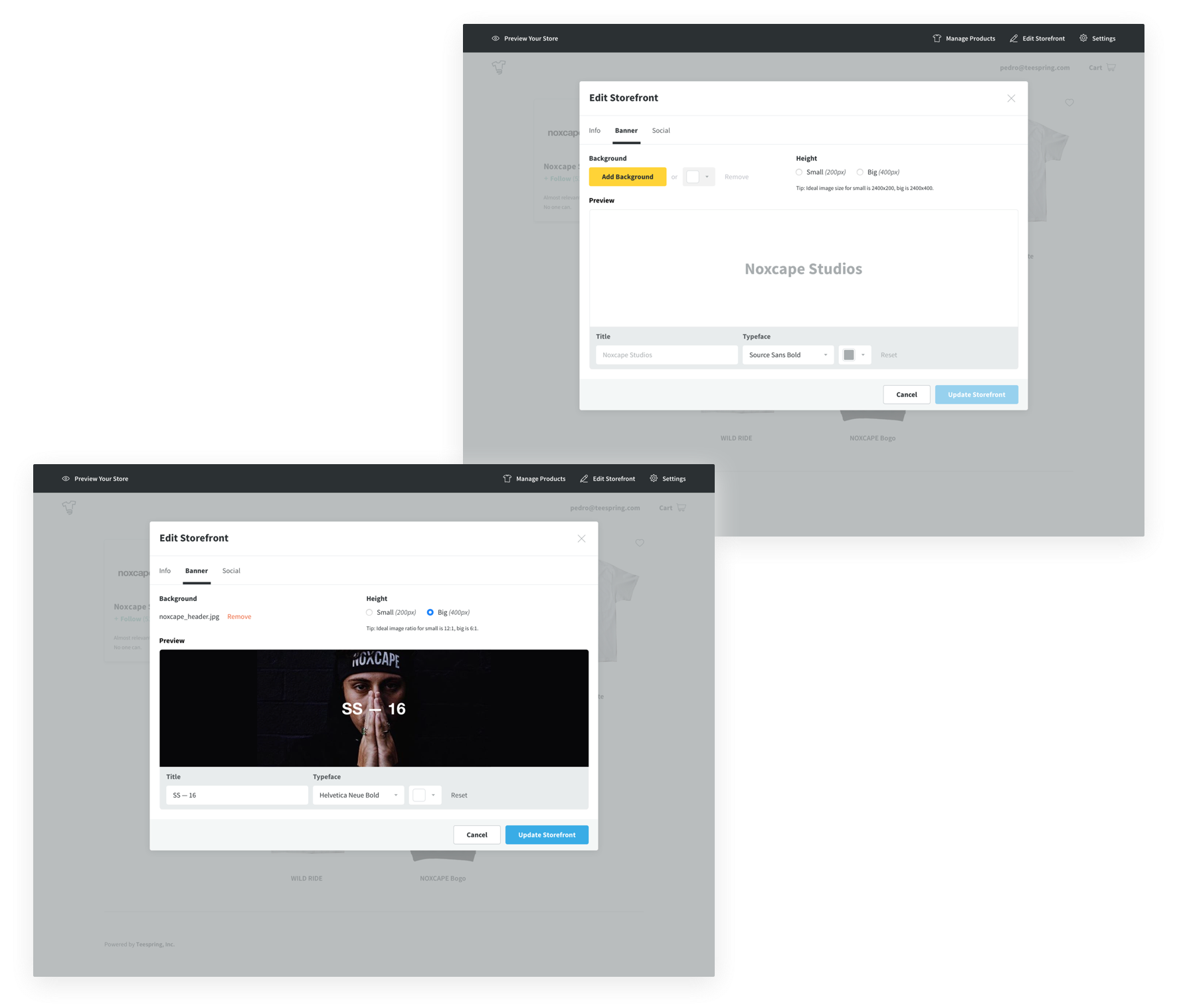
The managing your products flow was a dialog that popped that allowed the creator to add/remove products they've created under their userID to that storefront. This project did not include a redesign of that dialog, we simply updated its components (checkboxes, type, buttons) to design systems and shipped it. Below you'll see the final designs of the manage storefront info flow, including the blank & filled states:
Info tab
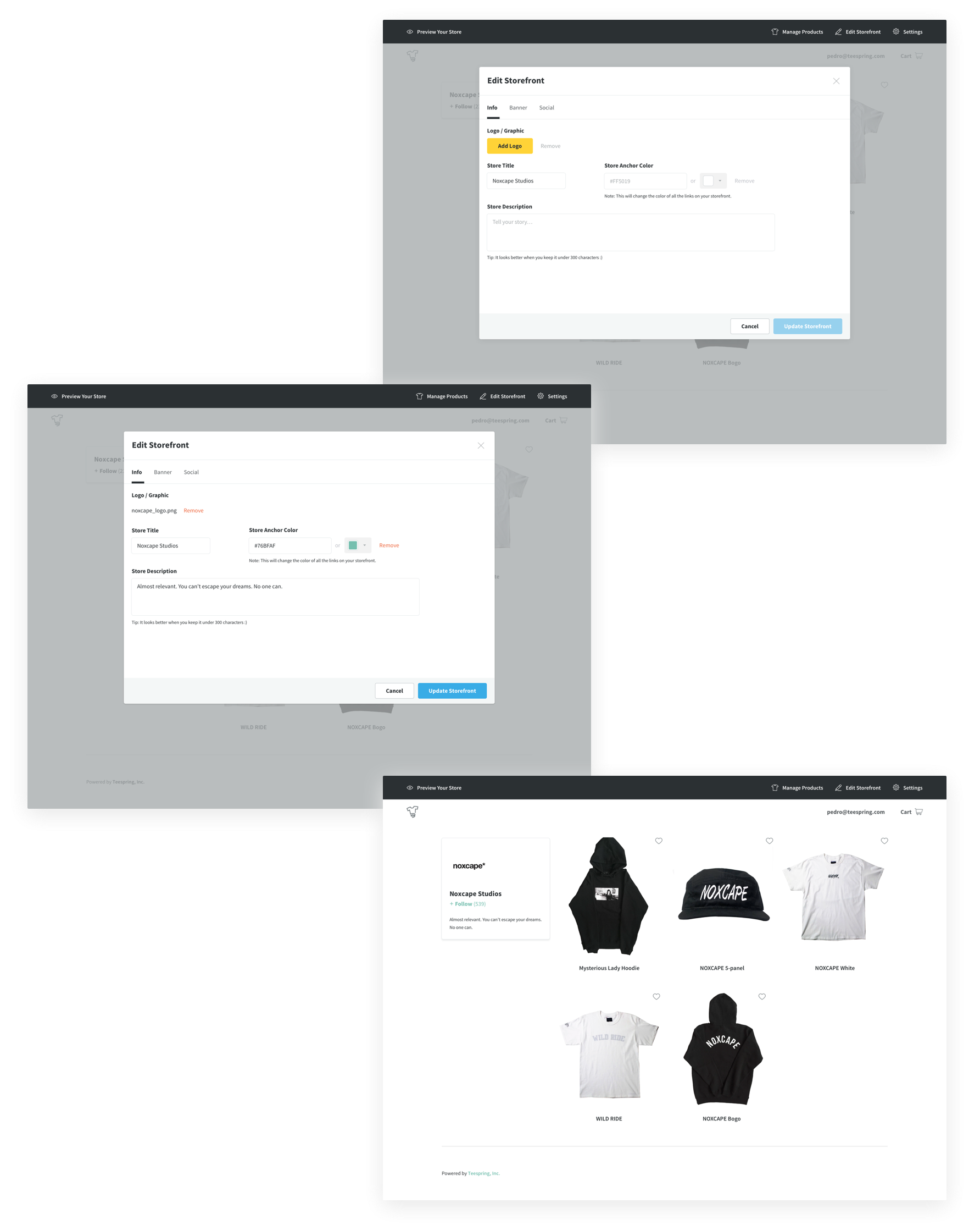
Banner tab
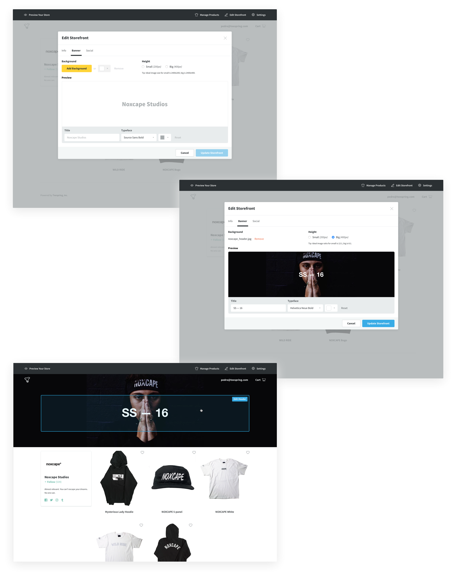
Social tab
Finally, this is what a filled out storefront looked like for the creator:
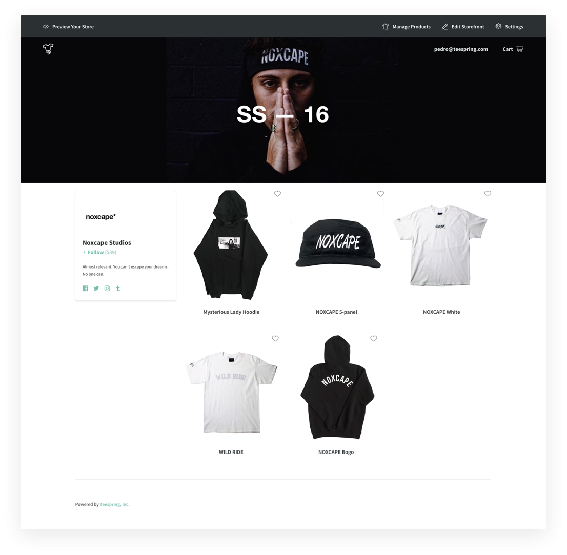
Buyer flow
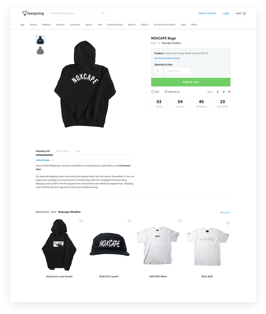
We designed the buyer flow based on the initial a/b test we performed. We wanted the buyer to see the storefront name and logo right alongside the product card. We also put the storefront catalog inside the campaign page to further the storefront engagement.
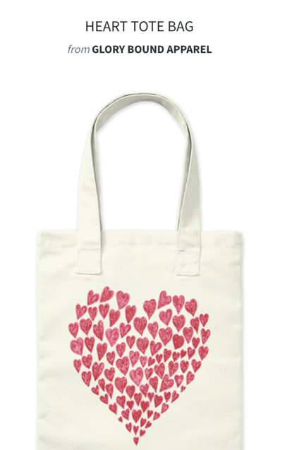
See the campaign page below:
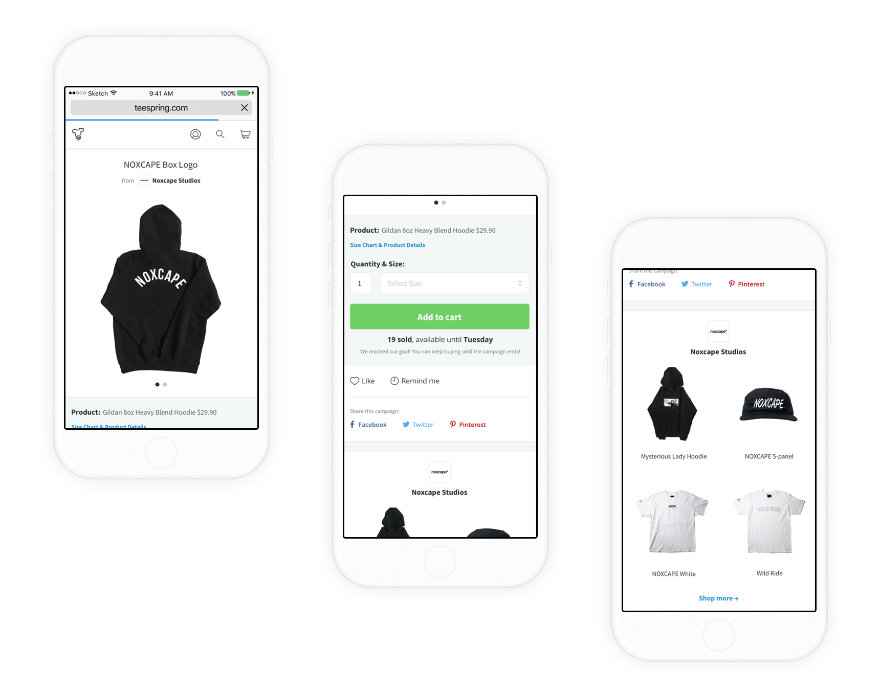
Storefront page:
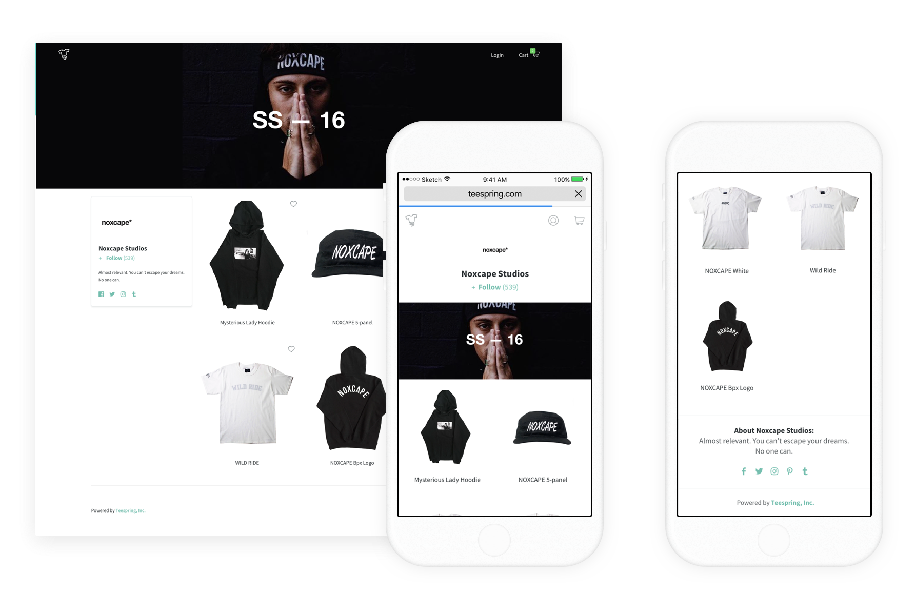
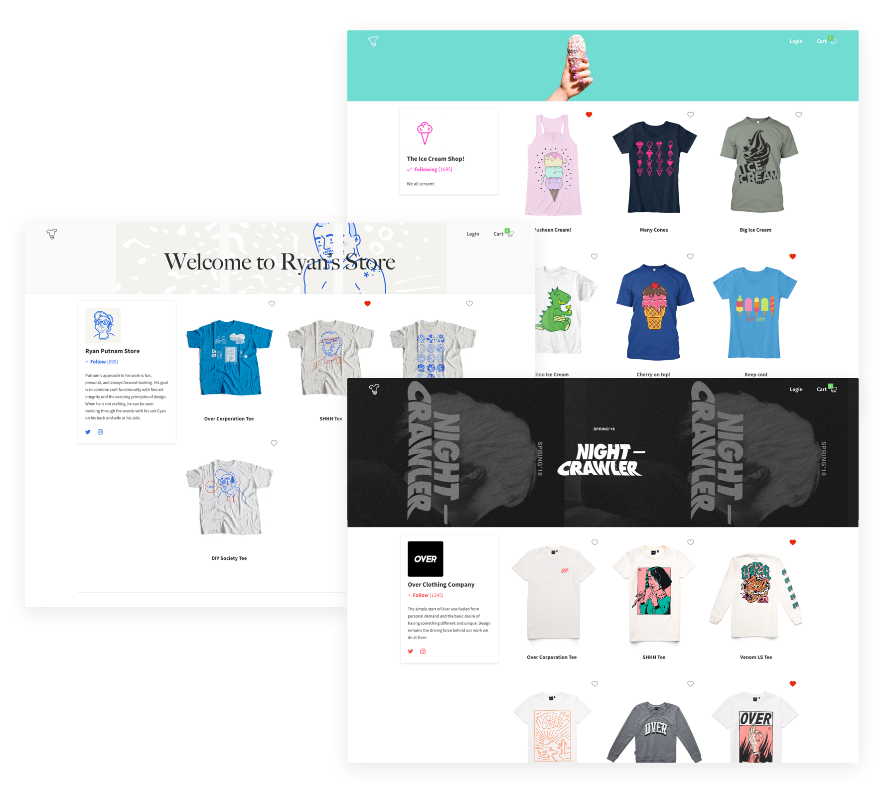
Other storefront examples:
Results
Unfortunately, I didn't stick around long enough to see how the results from our project improved conversion long-term. Before I left though, our project had already improved the campaign page conversion improved by 0.8% and when we released early beta for creators, we received tons of support and praise via social media.
Storefronts, or what Teespring now calls it collections, has become a big part of their product offering as you can see all over their homepage: teespring.com