Teespring Search
November 2016
Status: Shipped ✅
Role: Lead Product Designer
Collaborators: 1 Product Manager, 5 Engineers, 1 Data Scientist
Platforms: Web and Mobile Web
Link: Teespring Search
Context around the team and roles
This project was a part of the Teespring's Buyer pod, where I was the lead Product Designer. There was also 1 Product Manager, 4 engineers and 1 data scientist on the project.
As a product designer, I owned and drove all of the user interviews, market research, user research, prototypes and final implementation on interaction and visual design.
Company metrics and finding out what to work on
As a part of Teespring's buyer pod, our main company goal was to improve the experience of our buyers on the platform. Each quarter, we were given specific metrics to focus on. The metrics we were aiming for at the time were the following:
- Improve buyer conversion rate.
- Improve campaign page bounce rate.
We had some pre-built assumptions, so we began testing and designing a variety of different features to move this needle. Features such as improving product selection flow, checkout flow improvements, improving our e-mail recommendation engine, and other approaches.
Ultimately, partnering with the Data team, we found that our Search was the highest conversion funnel. In fact, we found that Search was already converting almost 2x more any other funnel in our buyer flow. So, naturally we decided to deeper into that product.
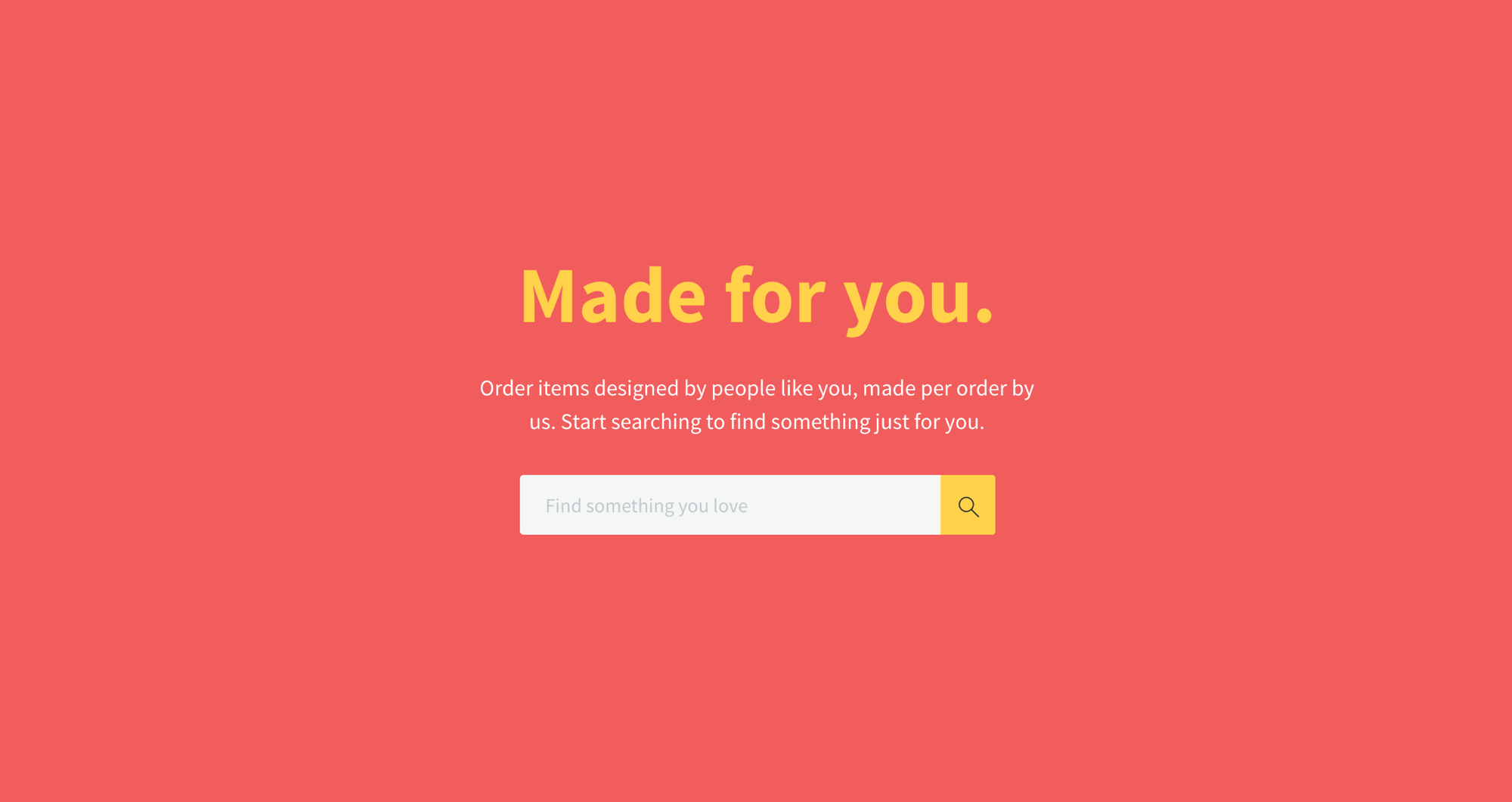
For context, this is what the old Search experience looked like at the time we set out to redesign it:
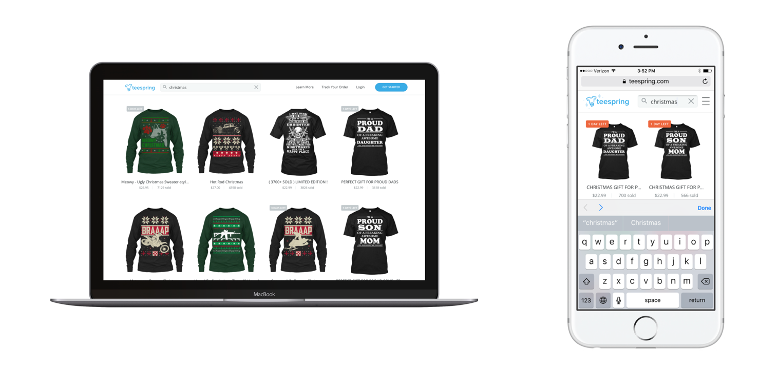
Yikes. The state of our search needed some love to say the least. Especially mobile, given most of our users were searching on mobile devices.
We knew we had our work cut out for us, but if we knew that if we could improve this experience even just a little, it would result in our buyers' coming back and trusting our Search even more than they do now.

User research and market research
We began by conducting user observation interviews to understand how our buyers use Search in other commerce platforms such as Amazon, Etsy, etc. Drawing some parallels, we were able to finding common themes around user behavior that drew our attention.
Simultaneously, we performed a lot of market research around similar commerce products, to find out what were some common features that made their Search experience great. We drew some parallels around market research and user interviews, finding features that drew the most opportunity of growth and impact.
Don't reinvent the wheel
We weren't out to invent a new way for our buyers to Search, we wanted to simply improve our Search by giving our buyers an experience they were already used to. So, naturally, I began to do deeper research around best practices on Search suggestions, filters and results.
A guy by the name of Greg Nudelman wrote an article back in 2009 on commerce filtering, best practices and the concept of Parallel Selection vs Drill Down filtering. Parallel meaning you can search for results in with parallel data points meaning check boxes. Drill Down meaning linking, drilling down to a level of taxonomy. We took all of that into account and decided to make the best Search possible. [Source]
From all of the research, we decided we were going to build Search around these three main features:
- Guiding the user through Search suggestions
- Clarity around Search results
- Drilling down results through Search filters
From this three features, we held ourselves accountable to these key principles or ideas:
- Guide our users with our database keyword suggestions
- Allow parallel selection and drill-down filtering
- Allow the users to make mistakes
- Only display filters applicable
- Give users visual feedback as soon as possible
Guiding the user feedback through suggestions
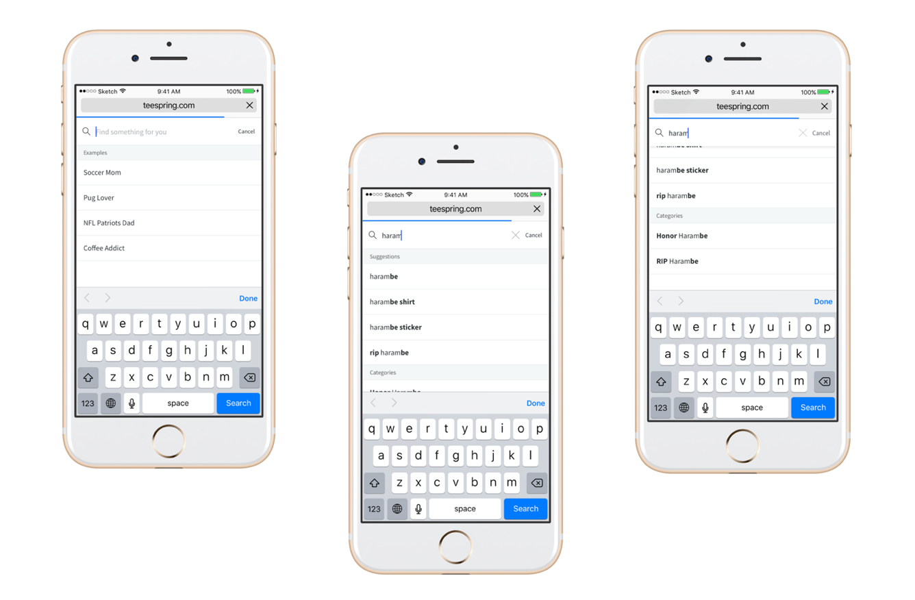
We designed a more focused mobile Search, giving buyers suggestions even before they typed, as well as adding suggestions as they type. We added keywords and categories from our database taxanomy, giving our buyers a clearer sense as to what to search for.
Before development, we built a few Invision and Framer prototypes to validate if this was helpful, and after conducting a few user testing sessions we found out that our users loved it.
During development, the engineering team put a ton of work into this, re-architecting our taxonomy, our keywords and getting rid of a ton of legacy code to name a few. It was all around a team effort and we were pleased with the result.
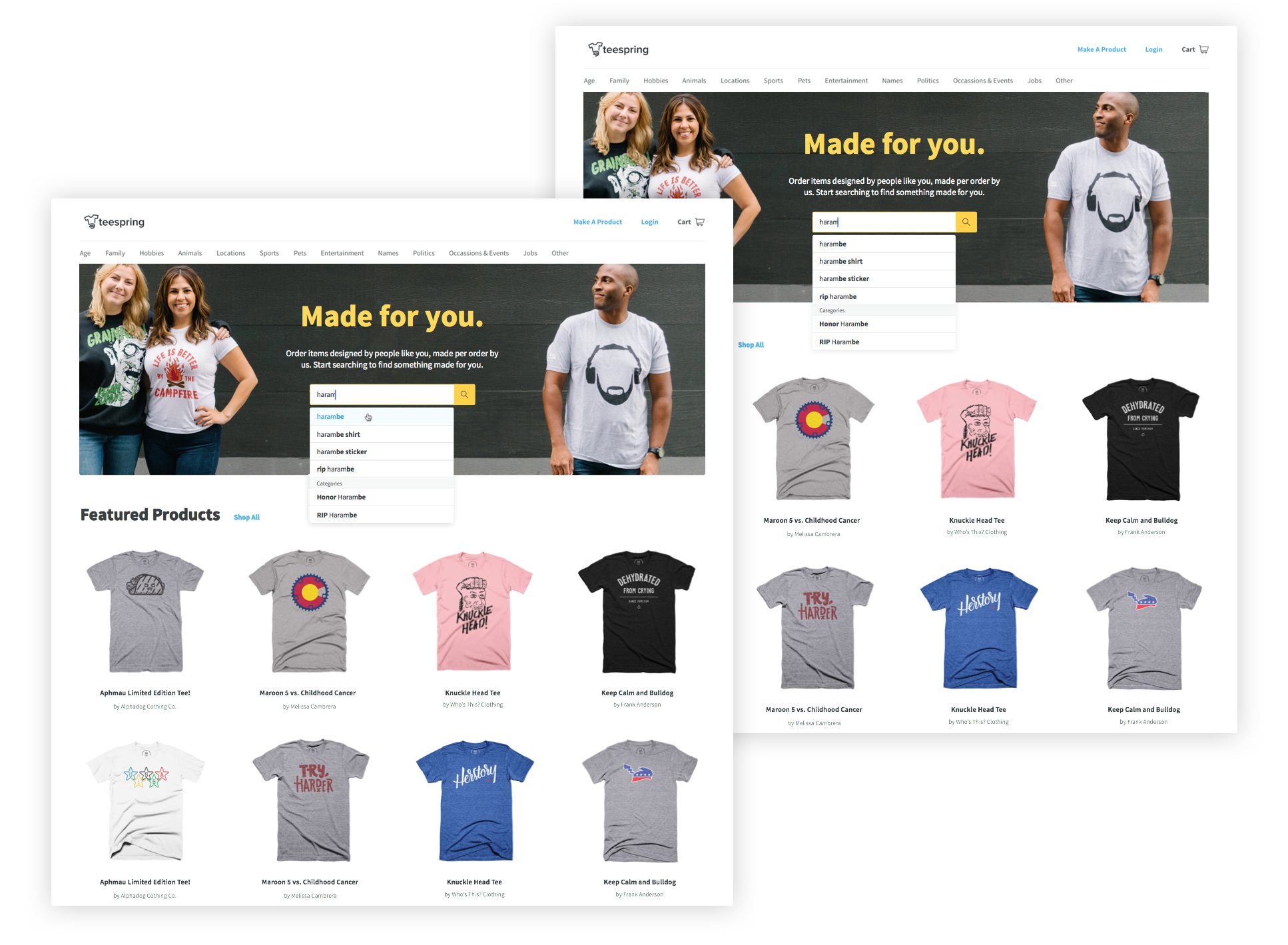
Clarity around results and Drilling down results through filters
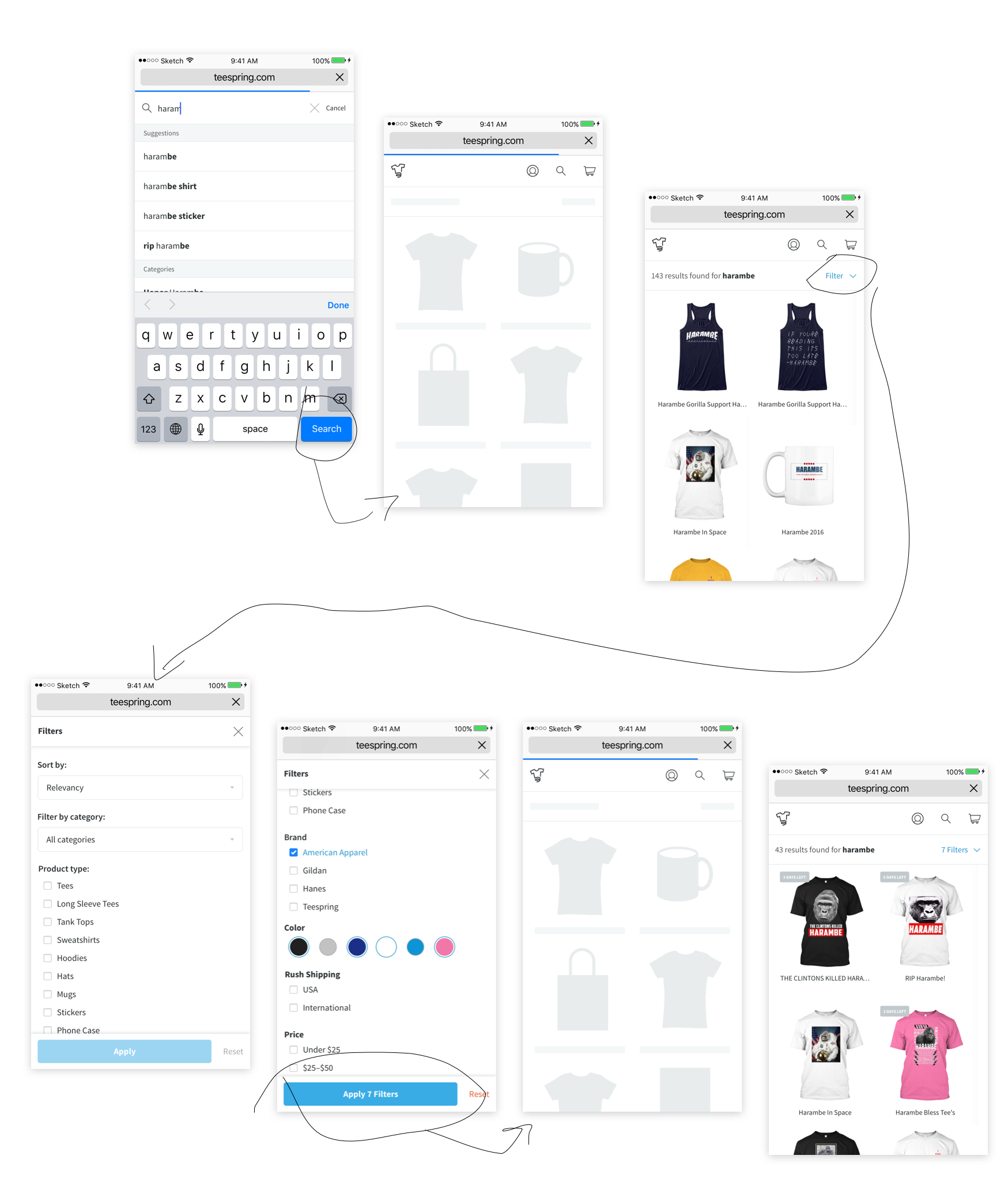
The first thing we wanted to tackle was giving the user more clarity throughout the Search results and filtering experience. We designed four things to help solve that:
- Skeleton loading state for the components on the page
- Display results found amount
- Display filter amount after a user has selected filters
- Allow the user to make mistakes by adding a reset option
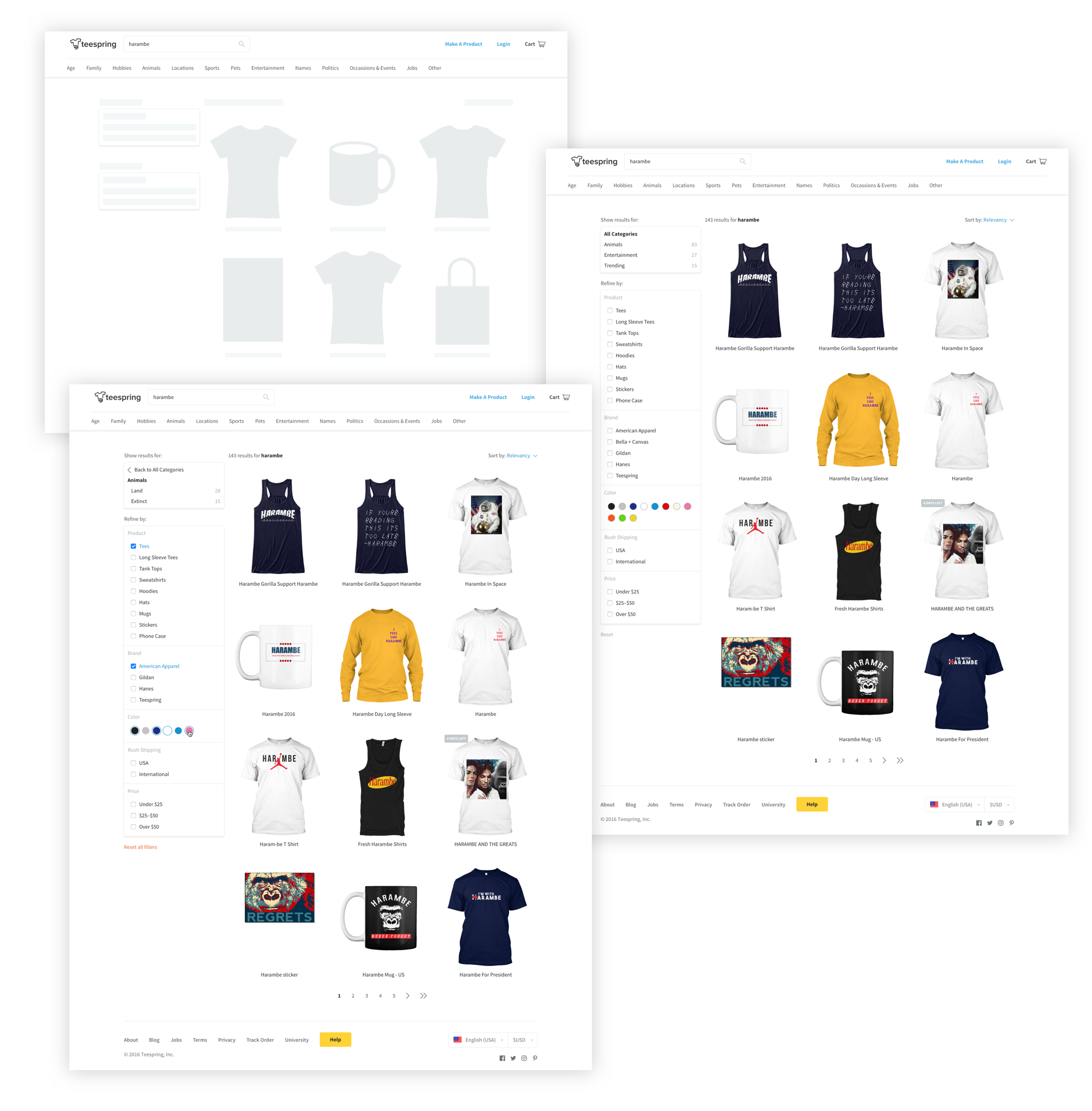
The second thing we wanted to tackle was giving the user a world-class filter feature. So, we designed a parallel and drill-down filtered Search. On desktop, on the left hand side of the grid, we gave the buyers options to navigate through categories of results as well as drilling down through refinement to find the specific product they were looking for. On mobile, the filter module took up the full screen because we wanted our users to have a focused experience while drilling down.
The filters set we built were, filter by:
- Category
- Product type
- Brand
- Color
- Shipping
- Price
Results:
At the time, right before I left the company, Search suggestions alone improved the conversion funnel by 3x and Search overall had improved its conversion rate to >15% across our web app. The results were that this feature dramatically improved our buyer conversion rate and consequentially improve campaign page bounce rate because we were helping buyers find exactly what they were looking for.
Play with Search live on teespring.com.