Simple Expenses
April 2018
Status: Shipped ✅
Role: Product Designer
Collaborators: 1 Product Manager, 1 Product Designer, 1 Engineering Lead, 7 Engineers, 1 Data Scientist, 2 User Researchers, 1 Copywriter
Platforms: Web, iOS and Android
Press: “Expenses are here!”
Links: Simple.com, App Store or Google Play

“Today’s paycheck is for tomorrow’s Expenses.”
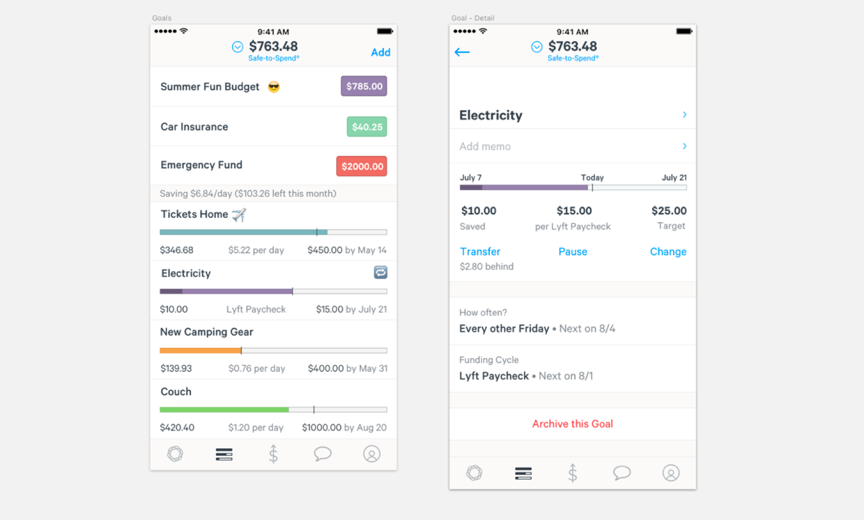
Before we dive into what that quote means, let’s dive into the discovery work that went into Expenses. To explain Expenses though, I first have to explain Goals. It is our most used feature and one of the biggest reasons our users love Simple. It allows users to create an envelope of money that Saves-over-time. It has a date attached to it and an amount, then we do the magic of calculating how much you need on a daily basis until that date arrives.
You can understand how the model works below:
Customer Problem
We started noticing trends of our users, they would duplicate their goals with the same name / amount or pushing back the dates to their goals when it came time to spend out of the goal, in order to manipulate the system to essentially reoccur.
Our users began using this Goals tool as a means to envelope their recurring payments, their bills, expenses, etc. Creating a "goal" like tool that automatically reoccurs for our users quickly became our most requested feature in the last 2 years. The experience to create recurring goals needed to exist within our app, it was clear. We just had to figure out how it would exist.
Collaborating with User Research & Engineering
Before solution designing what myself and the Product manager had in mind, we took the time to talk to our User Research team, evaluate the data they already had and talk to our Engineering leads to ask the effort vs cost on options. We knew this feature would hopefully change the way our users use Simple so we wanted to be data informed upon making the best decision.
We wanted to find the quickest, cheapest way to began to validate & test how users might use a feature like this. So we began asking questions like: does it sit on top of existing Goals UI? Do we leverage existing technology, if so how much of it? Do we start from scratch?
Product experience requirements
As Engineering was doing investigation on feasibility, the product manager and myself began to set a standard for product requirements. We took a stance on what the core product experience should require took it back to our stakeholders and they agreed. We decided that for Expenses to be a delightful experience it needed the full support of our “TriForce”.
The TriForce consisted of:
- The ability for a Goal reoccur.
- The ability for a Goal to fund itself the day you get paid.
- The ability for a Goal to spend from itself based on a category.
Now that we had our stakeholders and engineers on board on these functionalities having to exist with Expenses we knew this was our first priority before building the experience layer. This technology had to exist.
This bought me some time on the discovery side to really hone in on how the Experience should exist within the current structure of the app. Below are two of the many ideas we came up to use Expenses within the same Goals tab - one using iconography and text to distinguish an Expense from a Goal - the other using a two tab at the top of the screen set up:
Expenses Hierarchy
Ultimately though, we decided that Expenses was too important to now have its own tab. The reasons amongst many why Expenses needed its own tab is that we needed to show the user the concept of “Todays paycheck is tomorrow’s Expenses”. The concept that there are bills, expenses that are ready to be spent right now but at the same time, Simple is helping you save to spend on that next bill. It is a fundamental promise of this feature that could not get bloated with a different feature, Goals.
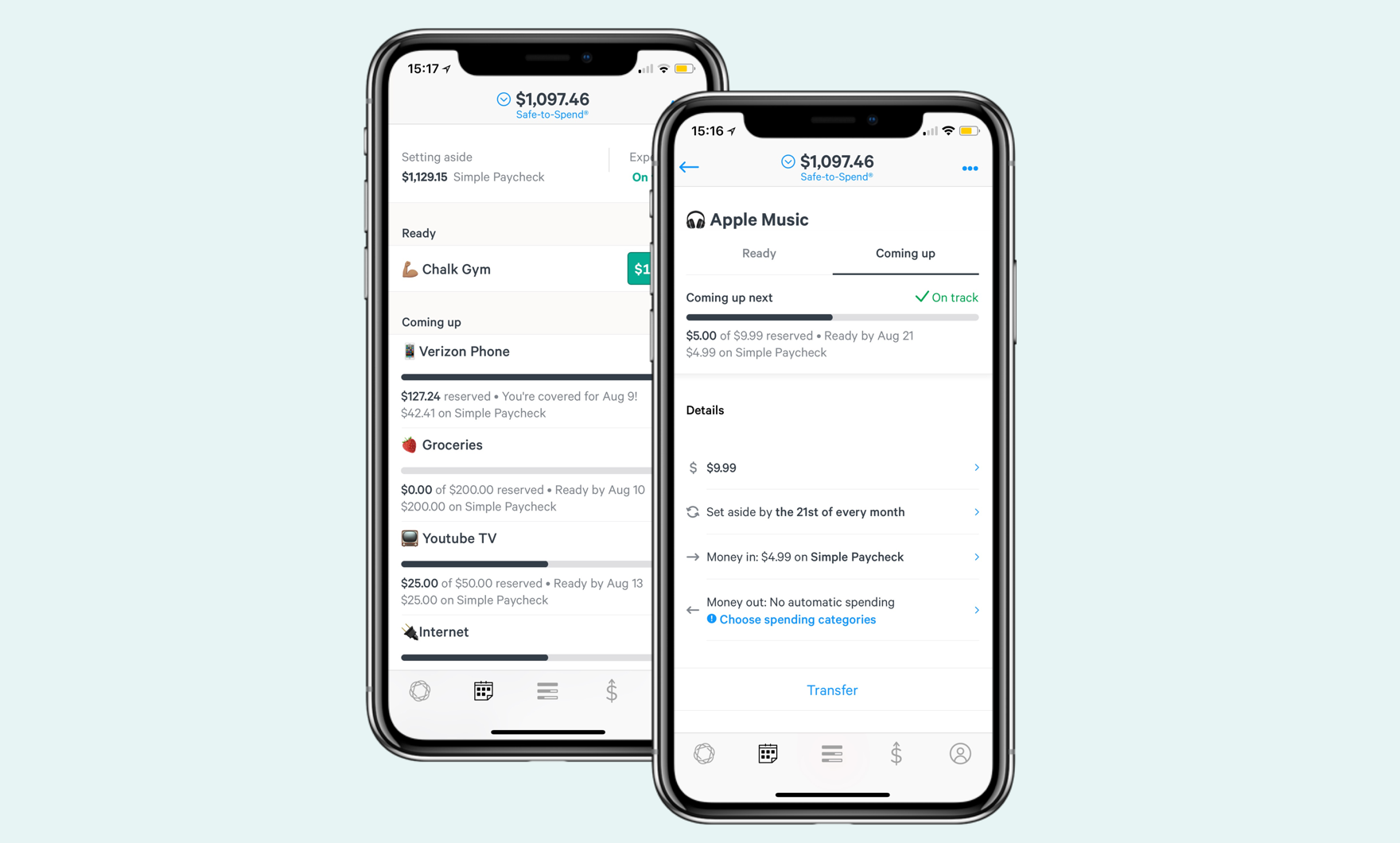
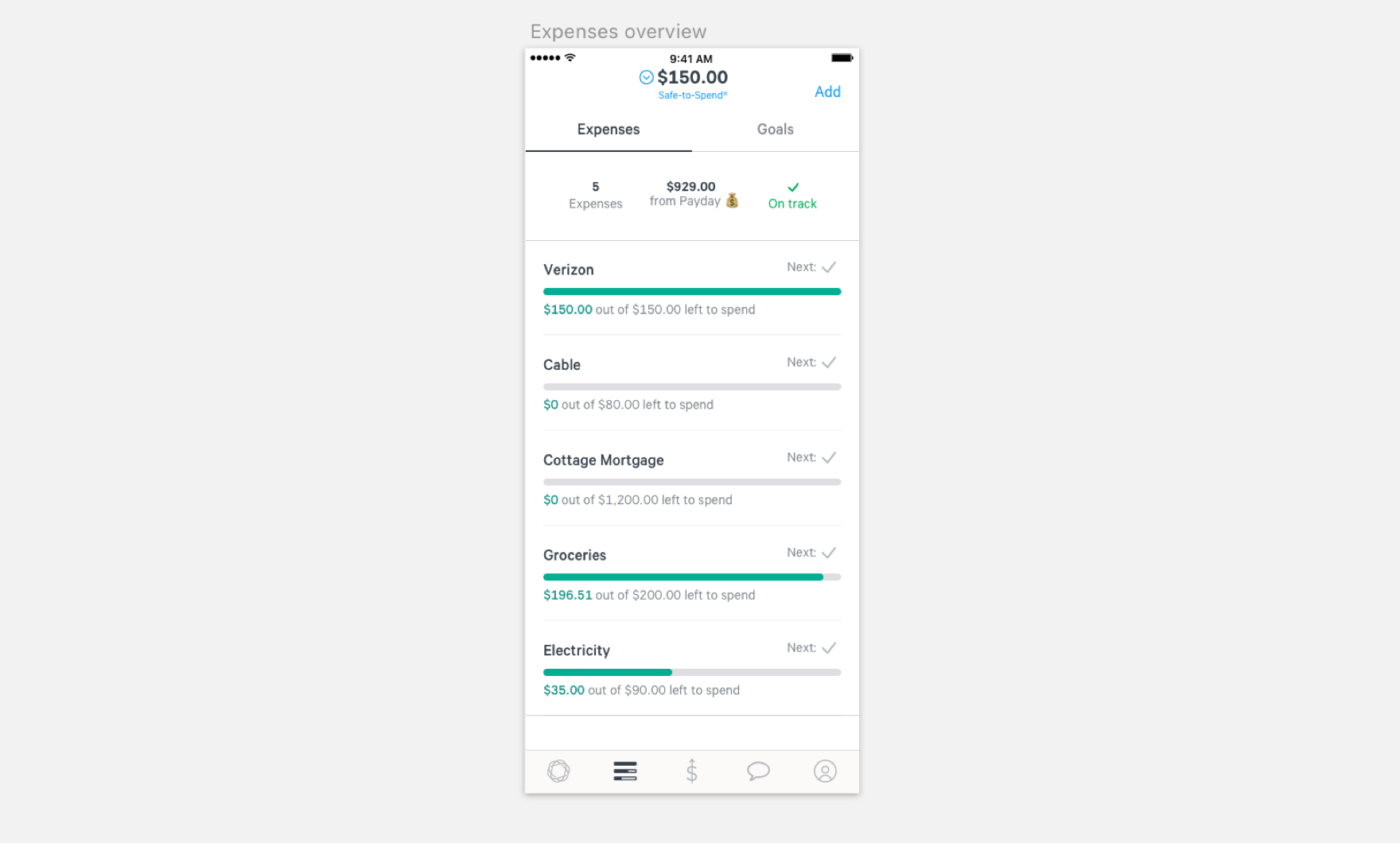
Expense hierarchy — First, we decided to remove the support chat tab, tucked it under account tab. At the very top there’s a summary of how much of your incoming Paycheck is going towards Expenses and there’s an on/off track status on Expenses, to indicate if an expense is behind or unaccounted for. Below that, there's two main sections: "Ready" and "Coming up". We wanted to introduce the concept of envelopes of money that were ready to be used vs envelopes that are building up with each paycheck.
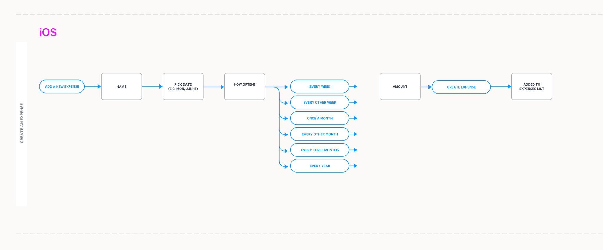
Below you will see where we landed on how the Expenses tab should functions:
Expenses Creation Flow
In the creation flow, we used it as an opportunity to educate the users on what type of Expenses you could create. From the fist onboarding screen, we give some suggestions such as Rent/Mortage, Groceries, Phone or Electricity. Typical bills an average adult might have. We wanted to emphasize that this tool was meant for bills and budgets.
The TriForce helped guide us on what steps the user would need to take to create an Expense:
- What is this for?
- When do you want to start spending?
- How often does it repeat?
- How much do you need?
And just like that, your Expense is created! We decided to keep this creation flow short in order to not overwhelm our users with new concepts. We wanted to keep the familiarity of Goals creation flow and improve upon it.
The last step to the creation flow we included as a CTA in the Expense detail page: "Choosing your spending categories". To automatically spend out of an expense when you spend on a category.As an example, when a user swipes at Whole Foods, it'll spend from their Groceries budget because the merchant is classified as groceries category. You can see the flowchart and the creation flow below!
Testing
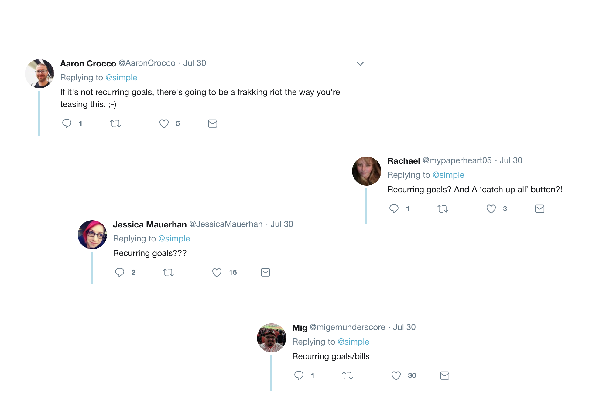
We built 2 to 3 iterations after user testing with employees and customers. After refining it, we were ready to put a pilot out to our customers. As word began to get out, we launched a teaser tweet. I think its safe to say what our users wanted:
Guess what!? Our most requested feature is launching soon. It’s cool, we’re freaking out too. What're you hoping it is? pic.twitter.com/YPdw3J8Iky
— Simple (@simple) July 30, 2018
Then, we launched! Engagement on social media, budgeting blogs (1, 2) media news outlets (1) and in our app was the highest we've seen since Goal launch.
It’s true. Our most requested feature launched today. Show those bills who’s boss and get started with automated Simple Expenses like, now. On a scale from 1-10 how excited are you? 🎉 pic.twitter.com/JUcu0UXn8R
— Simple (@simple) August 2, 2018
Download the app and check out this amazing budgeting tool, it has personally helped me save money and worry way less about my day-to-day financial status.