Simple Activity Feed
June 2018
Status: Coming Fall 2018
Role: Lead Product Designer
Collaborators: 1 Product Manager, 1 Engineering Lead, 5 Engineers, 1 Data Scientist
Platforms: iOS and Android
Prototype: Invision
Context around the Spend team at Simple
After wrapping up discovery, design & handoff of Expenses, I got moved to the Spend feature team. There, our main objective was to analyze how our users spend their money and provide better insights on how to improve managing their spending.
We designed a few features that helped our users better analyze their financial status, such as Low Balance alerts, displaying Safe-to-Spend amount left in transaction push notifications, amongst other small features. But we knew we could do more to improve our users knowledge of how their money is getting spent. So, the product manager and I teamed up with the data team to do some research.
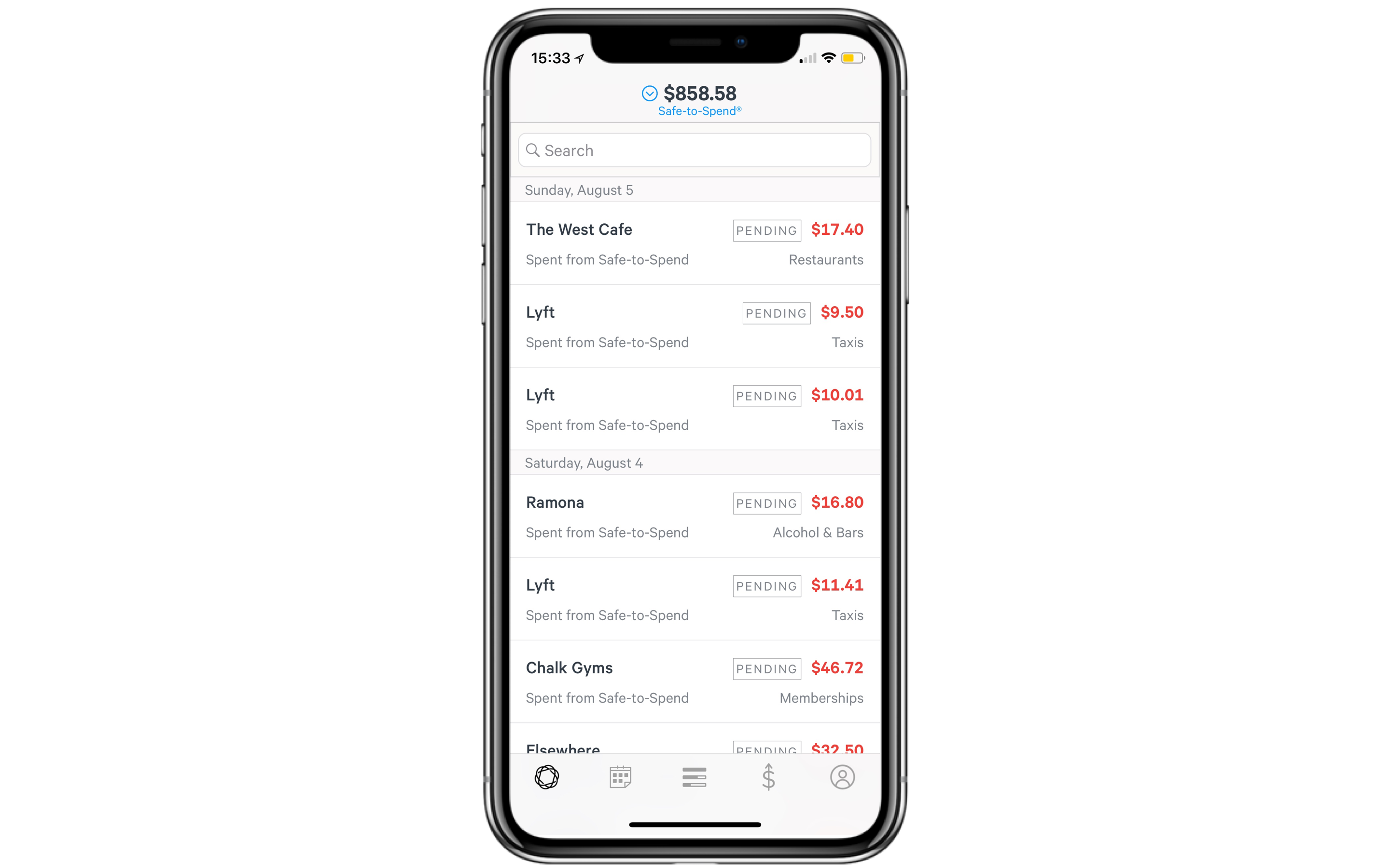
Data revealed that our customers look at their Activity Feed more than any other tab/page on our app but when we looked at the Activity Feed this is what we saw:

Customer Problem
The current Activity Feed is just a list of transactions; it didn’t help our customers visualize their full financial picture.
It was a part of our Product Vision to enrich this feed to be more useful for our users, with Expenses ramping up as well as the work of other feature teams…it became clear the Feed also needed to begin to reflect this new product experience. The Activity Feed needed to reflect exactly how all of our features came together to reflect a more beautiful banking experience.
Customer Value Prop
We didn’t just want to make the Activity Feed prettier though, we wanted to deliver a business value. We wanted to give our customers confidence when they opened the app and checked their Feed.
How would we deliver this confidence to our users? By improving the Activity Feed so that customers can easily see their money movement:
Income - Expenses - Savings/Goals = Safe-to-Spend
This will help our users understand their full financial picture better. As a consequence, we believe it will lead to increased engagement, balances, and swipes.
Design Goals
Let's be honest, a bank Activity Feed has been done before. At its core, it is a list of transactions, but at its full potential it can be so much more. So before I got into high fidelity designing, I wanted to clearly set out Design goals for myself, so when I look back at my proposed solution I could see that I never derailed from the original purpose of improving the Feed.
Here are my design goals I set out, proposed and later accepted by my team and stakeholders:
- Humanize the language.
- Modify & leverage our color system to educate our users on how their financial picture works
- It should be easy to scan, to find what you’re looking for.
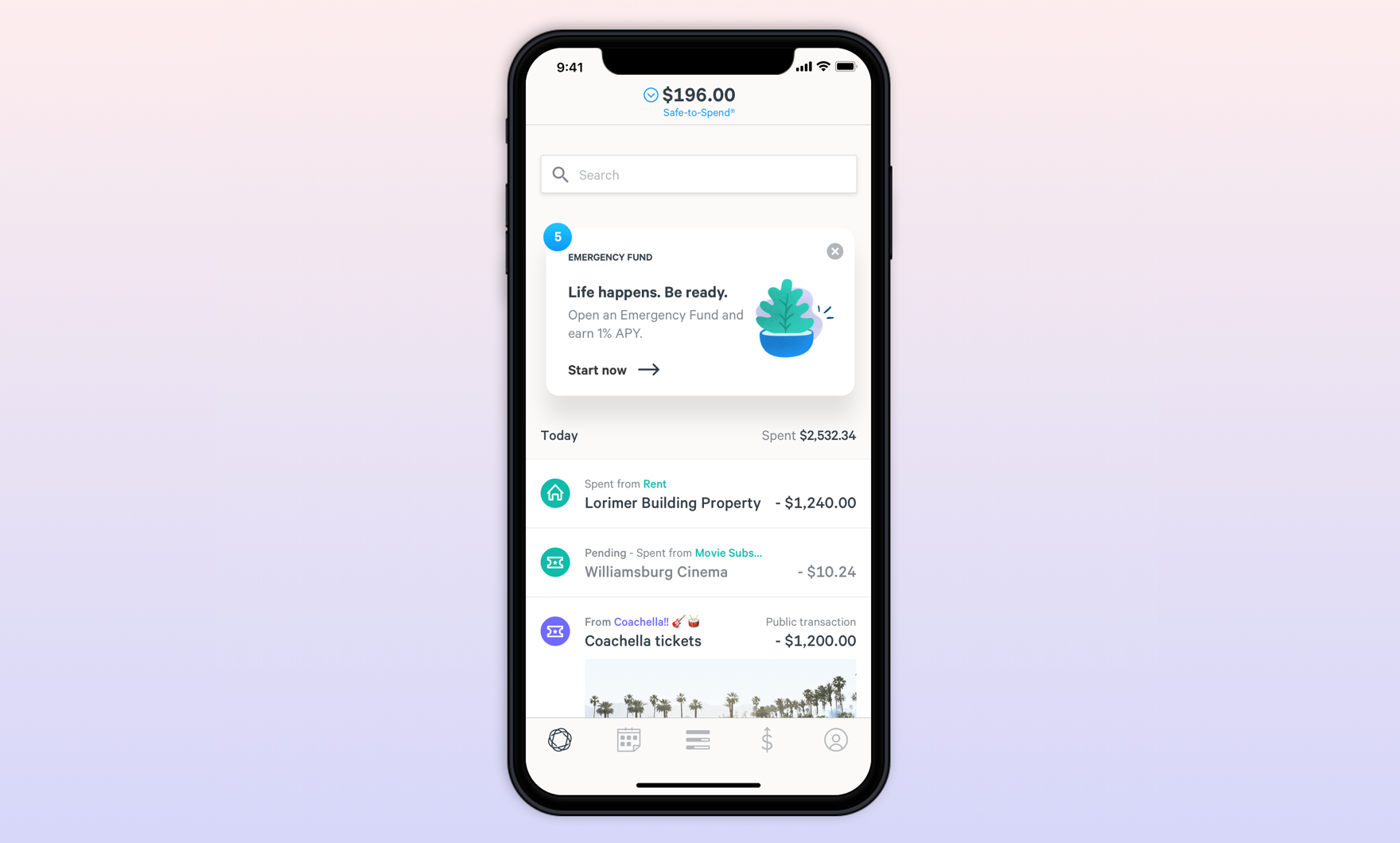
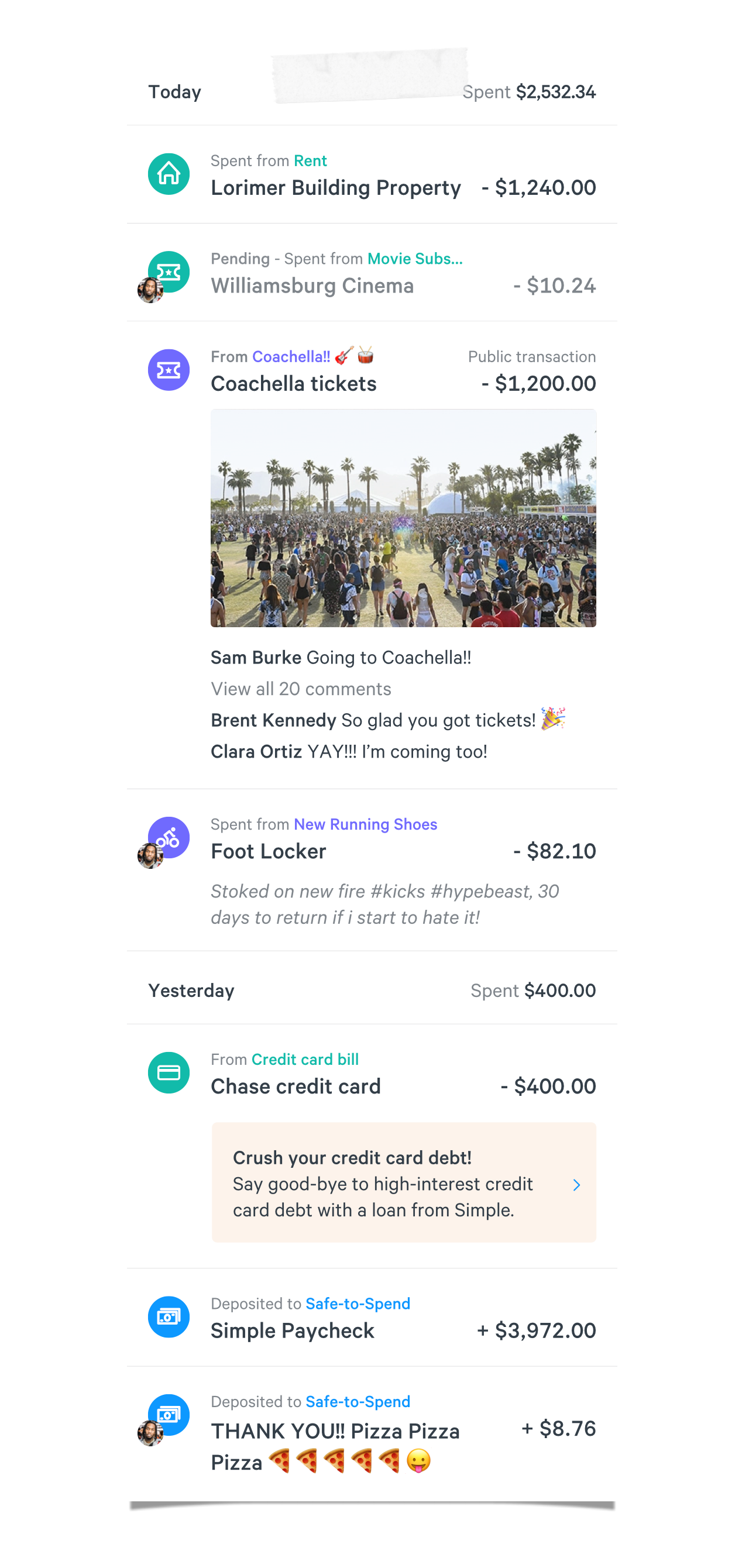
Key Features
Here are the defined improvements that we wanted to deliver, you can spot them on the image to the left:
- Humanize timeline language: Today, Yesterday, Wednesday, Tuesday, etc.
- Adding category icons to replace category label text.
- Add daily total of spent at the top of Today, Yesterday, etc.
- “Insights” cards embedded into the Feed, not only at the top of the Feed.
- Allow transactions to be made Public.
- Support for Shared Accounts.
Final product
Unfortunately, I left Simple before my team shipped this product but before I left it was on my team's pipeline. It was also properly documented and handed off.
Play with the prototype I built to show the desired interactions here.